
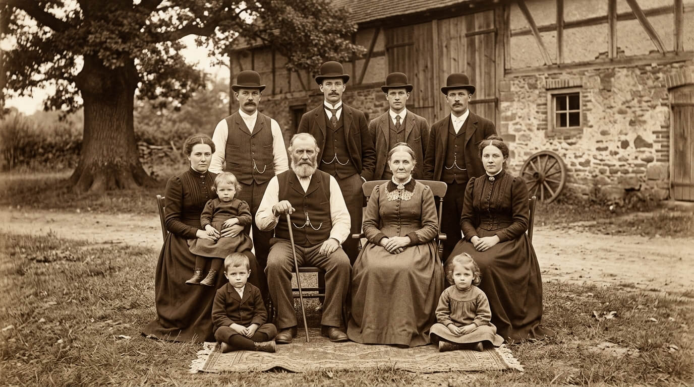
Sepia tone is a warm reddish-brown colour effect that gives photos a vintage look. The name comes from the ink of the cuttlefish, and in traditional photography sepia toning converted the silver in prints into a more stable brown compound. Today you can create it with a filter or by tinting a black-and-white image in photo editing software.
Key takeaways
- Sepia comes from cuttlefish ink and later became a photographic toning process.
- Old photos look brown because of the printing process, toning, and ageing.
- A common sepia colour code is #704214, but values vary between tools.
- You can create sepia with a one-click filter or by tinting a black-and-white image manually.
In this guide
- What Is Sepia?
- A Short History of Sepia
- Why Did Old Photographs Turn Brown?
- The Sepia Colour in Digital Design
- How to Create a Sepia Effect Digitally
- Sepia vs Black and White vs Vintage Filters
- When to Use Sepia
- When to Avoid Sepia
- Sepia in Art and AI Images
- Tips for Better Sepia Images
- Frequently Asked Questions
Last updated: October 2026
Sepia is the warm brown tone you instantly recognise in old photographs. It suggests history, nostalgia, and a softer view of the past. But sepia is more than a filter. It began as a natural pigment, became a chemical process that made photographs last longer, and is now a popular digital effect. This guide explains what sepia is, where it came from, why old photos turned brown, and how to create the look yourself.
What Is Sepia?
Sepia is a reddish-brown colour. The name comes from the cuttlefish, whose Latin genus name is Sepia. The dark ink of the cuttlefish was used for centuries as a pigment for drawing and writing. You can read about its colour history on Wikipedia. Today, “sepia tone” usually means a monochrome image tinted with brown instead of grey.
A Short History of Sepia
| Period | Development |
|---|---|
| Early use | Cuttlefish ink was used as a drawing and writing pigment |
| 19th century | Early photographic prints often had warm brown tones from the chemicals and papers used |
| Late 19th and early 20th century | Photographers used sepia toning to make prints warmer and more stable |
| Later 20th century | Black-and-white film and prints became common, with sepia as a creative choice |
| Digital era | Sepia became a filter in photo apps and editing software |
Why Did Old Photographs Turn Brown?
Several things explain the brown look of old photos:
- Printing process: some early printing papers and chemicals naturally produced brownish images.
- Toning: photographers deliberately treated prints in a toning bath. In sepia toning, the silver in a print is converted into a more stable compound, giving a warm brown colour and helping the print resist fading.
- Ageing: over time, silver images can oxidise and paper can yellow, shifting the colour towards brown.
For advice on keeping family photos in good condition, see the guidance from the US National Archives, and browse historic photographs in the Library of Congress picture collections.
The Sepia Colour in Digital Design
In design, sepia is typically a medium-dark brown with a hint of red or orange. A commonly used sepia hex code is #704214, though different tools use slightly different values. For photos, designers often use lighter, warmer sepia tints so highlights stay soft rather than flat brown.
| Part of the image | Typical sepia look |
|---|---|
| Shadows | Deep brown |
| Midtones | Warm tan or caramel |
| Highlights | Cream or soft ivory |
How to Create a Sepia Effect Digitally
Method 1: One-Click Filter
Most photo apps, social media tools, and online editors such as Canva include a sepia filter. It is the fastest way to get a vintage look, though you have less control.
Method 2: Manual Editing
- Convert to black and white. Start with a good monochrome version, adjusting brightness and contrast.
- Add a colour tint. Use a colour balance, split toning, or colourise tool in your editor, such as Adobe Photoshop or the free GIMP. Choose a warm orange-brown hue with moderate saturation.
- Adjust contrast and tone. Slightly lift the shadows and soften the highlights for a gentle, aged look.
- Add subtle texture or grain. A little film grain can add to the vintage feel, but do not overdo it.
- Compare with the original. Make sure the image still has detail and does not look muddy.
Sepia vs Black and White vs Vintage Filters
| Style | Look and mood |
|---|---|
| Black and white | Neutral, classic, and dramatic |
| Sepia | Warm, nostalgic, and soft |
| Faded colour or vintage filter | Retro, with muted but still visible colours |
When to Use Sepia
- Historical themes, family heritage projects, and memorial slideshows
- Wedding and portrait photography with a classic feel
- Vintage-style posters, menus, and branding
- Websites and presentations about history, antiques, coffee, or craft
When to Avoid Sepia
- When accurate colour matters, such as product photos and medical images
- When it makes text or small details harder to read
- When it is used only as a default and does not fit the mood
Sepia in Art and AI Images
Artists have long used sepia for drawings and washes. If you are exploring this style with image generators, words such as “sepia tone”, “vintage photograph”, and “warm brown monochrome” can steer the result. Our guide on how to create AI art explains how to write strong prompts, and our article on becoming a professional artist covers how to build a body of work.
Tips for Better Sepia Images
- Start with a sharp, well-exposed photo.
- Keep some contrast so the image does not look flat.
- Choose a tint that fits the subject and mood.
- Test on different screens, since browns can look different on each.
- Save the original file, and work on a copy.
Frequently Asked Questions
It is a warm reddish-brown tint applied to a monochrome image, giving it a vintage look.
It comes from the cuttlefish genus name Sepia, as the animal ink was used as a brown pigment.
Some printing processes produced brown tones, photographers used sepia toning, and ageing can shift colours towards yellow and brown.
A commonly used value is #704214, though different software uses slightly different sepia colours.
Use a sepia filter in an editing app, or convert to black and white and add a warm brown tint using colour balance or a colourise tool.
No. Black and white uses neutral greys, while sepia adds a warm brown tint.
This article is general information. Colour values and tool menus vary between software versions.